Landing Page for Lead Generation: Structure and Conversion

TL;DR
A lead generation landing page is a single-page site designed to turn traffic into leads. This article covers the mandatory 10-block structure, lead capture form and CTA rules, a comparison of classic vs. quiz landing pages, key metrics (conversion rate, CPL, CTR), and a launch checklist.
A lead generation landing page is a single-page site with one goal: turning incoming traffic into leads and contacts from potential customers. Unlike a corporate website with dozens of pages and multiple user paths, a lead-gen landing page guides the visitor along a single line of reasoning — from pain point to offer to lead capture form. Below we’ll break down the mandatory landing page structure, key metrics, the form, the CTA, quiz landing pages as a separate format, and a launch checklist.
What a lead generation landing page is and why you need one
Lead generation is the process of collecting contacts from people who’ve shown interest in a product. A landing page for lead capture is the tool that locks in that interest. Lead generation through landing pages works because the page removes distracting links and focuses attention on a single action: leaving a phone number, an email, or completing a quiz.
When a lead-gen landing page is especially useful:
- launching paid traffic (search ads, targeted ads) where measuring cost per lead matters;
- testing a specific offer or service quickly;
- building a database via a lead magnet — a checklist, calculator, or webinar;
- qualifying cold audiences before handing them off to sales.
An important axiom: leads aren’t generated by the landing page alone, but by the combination of “offer + traffic + page.” Even a perfect block structure won’t save a weak offer or untargeted traffic. That’s why the ad strategy for a landing page and the page itself should be designed together.
Key metrics: landing page conversion rate, CPL, form CTR
Before building out landing page blocks, let’s agree on what and how to measure. Without numbers, “improving landing page conversion” becomes a matter of taste.
- Landing page conversion rate (CR) — the share of visitors who submitted a lead form. The market median is 2-3%; a good result for services and B2B is 5-8%.
- CPL (cost per lead) — ad spend divided by the number of leads. This is the key profitability metric: low conversion with a cheap, targeted lead beats high conversion with an expensive, untargeted one.
- Form CTR — the share of visitors who started filling out the lead capture form among those who scrolled to it. It shows how clear the offer and fields are.
- Share of qualified leads — how many submissions turn into real conversations. Leads aren’t buyers yet, and quality matters more than volume.
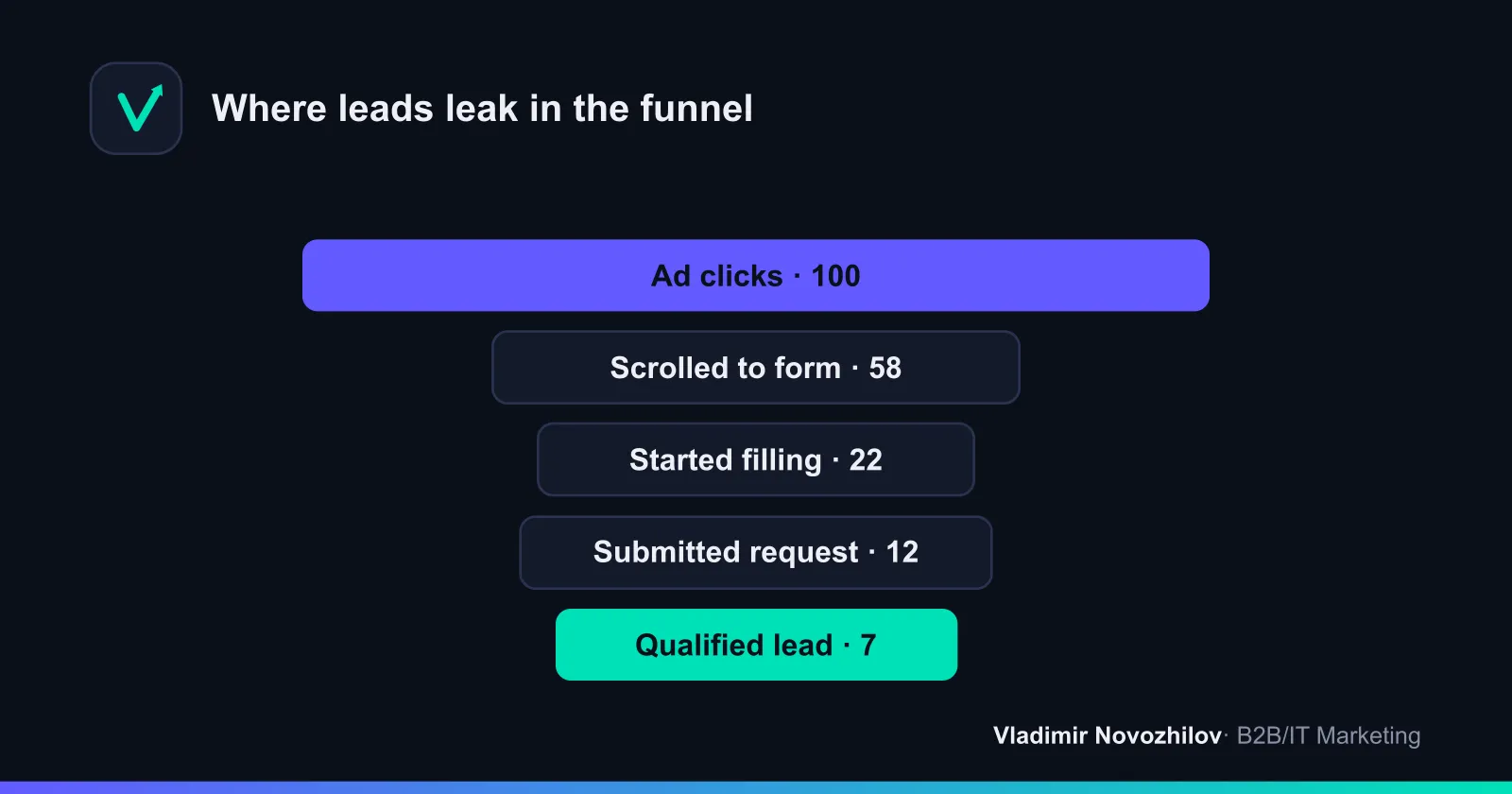
Track these metrics through Google Analytics and UTM tags on every traffic source, and monitor on-page behavior with heatmaps and session recordings. That way you’ll see exactly which block is losing the audience.
Mandatory landing page structure: 10 blocks from hero to footer
Below is a landing page block structure that addresses the visitor’s main questions in order. This is a framework: trim it for warm traffic, expand it with case studies and guarantees for cold traffic.
| # | Landing page block | Block’s job |
|---|---|---|
| 1 | Hero section (first screen) | Explain in 3-5 seconds what you offer and to whom, and provide a form or button |
| 2 | Customer’s problem | Show the audience’s pain point so they recognize themselves |
| 3 | Solution (offer) | State how the product relieves that pain |
| 4 | Benefits | Translate features into concrete value and outcomes |
| 5 | Social proof | Build trust through case studies, testimonials, logos, numbers |
| 6 | How it works | Show the process in 3-4 steps to remove fear of the unknown |
| 7 | Lead capture form | Give an easy way to leave contact info |
| 8 | Objection handling (FAQ) | Address “too expensive,” “what if it doesn’t fit,” “how long will it take” |
| 9 | Repeat CTA | Capture those who read through and warmed up |
| 10 | Footer | Contacts, company details, messengers, privacy policy |
The rule is simple: each block answers one question in the visitor’s mind. If a block doesn’t address anything, it’s dead weight, dragging down conversion through added length and diluted attention.
Hero section: headline, subheadline, lead capture form
The hero section decides everything: studies show headlines get read 4-5x more often than the rest of the text. It needs to pass the “blink test” — within 3-5 seconds the visitor should understand where they landed and what they’ll get.
A template for the first-screen structure:
- Headline — an offer with a benefit and specifics. Example for a service: “We’ll build your sales department from scratch in 30 days — with CRM, scripts, and trained reps.”
- Subheadline — clarifies who it’s for and how it delivers. Example: “For B2B companies with $1M+ revenue: boost deal conversion without hiring a new team.”
- Form or button — 2-3 fields or a prominent CTA like “Get a Quote.”
- Trust anchors — 2-3 facts: “120 projects completed,” “8 years in business,” client logos.
Avoid abstractions like “We’re a team of professionals.” Specifics (“−30% cost per lead in 2 months”) sell better than adjectives.
The “problem-solution” block and addressing audience pain points
People buy solutions to problems, not products. In the “problem” block, articulate 3-4 real pain points in the customer’s own language: “we get leads but no sales,” “managers lose leads in messenger apps.” Then, in the “solution” block, show how the offer resolves each pain point. This pairing builds recognition and trust before the visitor even reaches the form.
Social proof and trust elements
Social proof is the most underrated conversion lever. What works:
- testimonials with a name, photo, and specific result (numbers are more persuasive than emotions);
- “before → after” case studies with figures;
- client and partner logos;
- certificates, awards, media mentions;
- counters: number of leads processed, years in business.
One testimonial with a full name and a figure like “cut CPL by 34%” is worth more than ten anonymous “loved it” comments.
Lead capture form: how many fields you need and how to boost form conversion
The lead capture form is the point where interest turns into a contact, and it’s where most leads are lost. The basic rule: minimize fields. The sweet spot is 2-3 fields (name + phone or email). Every additional field lowers response rates.
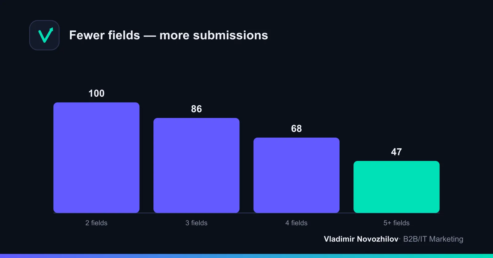
How to boost form conversion:
- keep only critical fields, clarify the rest during the call;
- label the button with the outcome (“Get a Quote”), not “Submit”;
- add a short promise nearby: “We’ll call you back within 15 minutes, no spam”;
- show that data is protected (a consent checkbox, a plain-text link to the privacy policy, not a hyperlink);
- use correct mobile keyboard types for phone and email fields.
A strong accelerator is a lead magnet: a free checklist, calculator, template, or demo in exchange for contact info. It lowers the barrier because the person gets value immediately, rather than “someday after the call.”
CTA and call to action: button design rules
A call-to-action (CTA) is both the button text and its visual weight. The rules:
- a contrasting color that stands out against the background;
- an action verb tied to a benefit: “Get,” “Calculate,” “Book”;
- one target action per screen — don’t split attention;
- repeat the CTA after key blocks (benefits, case studies, FAQ);
- add microcopy under the button that eases anxiety (“No obligation”).
Quiz landing pages as an alternative lead capture format
A quiz landing page is a lead-gen page where the visitor first answers 3-6 questions, then leaves their contact info to receive a personalized result, recommendation, or calculation. This format engages visitors and lowers the barrier: since they’ve already invested effort, they’re more willing to share their phone number.
| Criterion | Classic landing page | Quiz landing page |
|---|---|---|
| Logic | Reads blocks → submits a lead | Answers questions → gets a result |
| Entry barrier | Higher: form is visible right away | Lower: engagement precedes the form |
| Lead conversion | 2-5% on average | Often 1.5-2x higher |
| Lead quality | Higher — the person read the offer | Lower — requires qualification |
| Customer data | Contact info only | Contact info + answers for segmentation |
| Best fit | Complex service, strong offer | Selection, calculation, broad niche |
A quiz works well where there’s a choice of parameters: picking a plan, configuration, or estimate. But keep in mind — it generates more leads, some of which need filtering out. It’s optimal to run both formats and compare by CPL and share of qualified leads.
Technical requirements: load speed, responsiveness, SEO
Even a flawless landing page structure won’t work if there are technical issues.
- Load speed. Every extra second cuts into conversion. Check your page in PageSpeed Insights, compress images, remove heavy scripts. Aim for a 2-3 second load time.
- Responsiveness (mobile-first). Over half of your traffic is mobile. Design for smartphones: large buttons, short forms, readable fonts.
- SEO basics. Even for paid traffic, fill in the title, description, image alt text, and headings — this helps both organic search and snippet quality.
- Analytics and UTM tags. Set up goals in Google Analytics, add UTM tags to every source, and connect heatmaps for behavior analysis.
A/B testing and heatmap analysis to boost landing page conversion
A/B testing is the only honest way to figure out what actually raises conversion. Change one element at a time (headline, offer, button, number of fields) and compare on comparable traffic.
What to test first: the hero headline, the offer’s wording, the CTA text and color, the length of the lead capture form, and the order of blocks.
Heatmaps and session recordings show where visitors click, how far they scroll, and at which block they drop off. Combining analytics numbers with behavioral data from heatmaps points to growth opportunities more precisely than intuition alone.
| Tool | What it does | When to use it |
|---|---|---|
| Google Analytics | Traffic, goals, conversion, sources | Baseline lead and CPL analytics |
| Yandex Metrica | Goals, Webvisor, click maps | Russian-speaking traffic, session recordings |
| Hotjar | Heatmaps, recordings, surveys | On-page behavior and friction points |
| PageSpeed Insights | Speed and Core Web Vitals | Load speed diagnostics |
| Built-in A/B in page builder | Split-testing variants | Quick hypothesis testing without code |
A quick pre-scaling check: run 100-300 clicks with UTM tags, record conversion and CPL, and review heatmaps. If it fits your unit economics, scale the budget; if not, fix the offer and hero section.
Common mistakes when building a lead-gen landing page
- A vague offer. “High quality and affordable” promises nothing — you need specifics and results.
- A long form. 6 fields instead of 3 cut submissions with no benefit to the business.
- A single CTA on the whole page. Long landing pages need 2-3 capture points.
- No social proof. Without testimonials and case studies, cold traffic won’t trust you.
- Slow loading and poor responsiveness. Mobile visitors leave before reaching the form.
- Traffic mismatched with the offer. The ad promises one thing, the landing page another — conversion drops.
- No analytics or UTM tags. Without data, you can’t know what to improve.
Examples of successful landing pages with conversion elements broken down
Let’s look at techniques that deliver results (generalized patterns from strong pages).
- B2B service (CRM implementation). A hero section with specifics — “−30% lost leads in 2 months” — a 2-field form, and a case-study block with numbers. The winning combination: a numeric offer plus a testimonial with results.
- Online education. A lead magnet — “free lesson + checklist” — in exchange for an email. Conversion rises thanks to instant value delivered before any sale.
- Home renovation and construction. A quiz landing page — “get your estimate in 1 minute”: 5 questions, then a form. Engagement boosts submissions, followed by phone qualification.
- SaaS service (a brief example). A “Try for free” button instead of “Buy,” demo access as the lead magnet, minimal fields — lowers the barrier to the first step.
- Consulting. A long landing page with a strong objection-handling (FAQ) block and 3 repeated CTAs — warms up cold audiences before they submit a lead.
The common thread across examples from different niches: a concrete offer, a short form, and honest social proof.
Launch checklist for a lead generation landing page
Go through this list before turning on ads. It’s your downloadable self-check mini-template — copy it into your notes.
- The offer is specific, with a clear benefit and a number.
- The hero section passes the blink test in 3-5 seconds.
- The headline and subheadline answer “what” and “for whom.”
- The lead capture form has 2-3 fields.
- The CTA button describes the outcome, not just “Submit.”
- There are at least 3 pieces of social proof with numbers.
- The “problem-solution” block is written in the customer’s language.
- There’s a “how it works” block with 3-4 steps.
- A lead magnet or bonus is offered in exchange for contact info.
- A repeat CTA appears after the benefits and case studies.
- The FAQ addresses 4-6 key objections.
- The page is optimized for mobile (mobile-first).
- Load speed has been checked in PageSpeed Insights.
- Goals, UTM tags, and heatmaps are set up.
- A plan for A/B testing the headline and form is ready.
If fewer than 12 items are checked, don’t scale your ad budget yet — refine the page first. This approach saves ad spend and boosts landing page conversion before the very first click.
Key takeaways
A lead generation landing page is a discipline, not an art project: a concrete offer, a logical 10-block structure, a short lead capture form, a strong CTA, and continuous A/B testing. Classic and quiz landing page formats solve different problems — test both by CPL and lead quality. Measure conversion, cost per lead, and behavior through analytics and heatmaps, and improving your landing page conversion becomes a manageable process rather than a matter of luck.
FAQ
- How many blocks should a lead generation landing page have?
- There's no universal number, but a working framework is 10 blocks: hero section, problem, solution, benefits, social proof, "how it works," lead capture form, objection handling, repeat CTA, and footer. For cold traffic the structure is longer; for warm traffic you can trim it to 5-6 blocks. What matters isn't the count but the logic: each block should address a specific question or objection the visitor has.
- How many fields should a lead capture form have for maximum conversion?
- Optimally 2-3 fields: name and phone or email. Industry data shows that cutting a form from 4 fields to 3 consistently lifts conversion by 10-25%. Every extra field reduces response rates, so only ask for what you truly need for first contact — clarify the rest with a manager or at the next step.
- What is a quiz landing page and how does it differ from a classic one?
- A quiz landing page is a lead-generation page where the user answers 3-6 questions and leaves their contact info to get a personalized result or calculation. Unlike a classic landing page, where the form appears right away, a quiz engages visitors and lowers the psychological barrier. It often delivers a lead conversion rate 1.5-2x higher, but the leads tend to be less warmed up, so qualification becomes essential.
- What's considered a good average landing page conversion rate?
- The market median landing page conversion rate is around 2-3%. A good result for B2B and services is 5-8%, and for narrow offers with a strong lead magnet it can reach 10% or more. Don't judge by an abstract percentage alone — factor in cost per lead (CPL) and lead quality: a landing page converting at 3% with cheap, targeted leads is more profitable than one at 8% with untargeted leads.
- Should the lead capture form be duplicated at the bottom of the page?
- Yes. Visitors rarely commit on the first screen — they need to read through the arguments first. A repeat CTA and form after the benefits and social proof blocks capture those who read through and warmed up. On long landing pages, 2-3 capture points plus a sticky button are appropriate.
- How can you quickly test a landing page's effectiveness before scaling ad spend?
- Run a test budget for 100-300 clicks with UTM tags, check the conversion rate and cost per lead, and study behavior via Hotjar heatmaps and Google Analytics reports. If conversion and CPL fit your unit economics, scale up. If not, fix the hero section, offer, and form through A/B testing of the landing page before increasing spend.